*This page is still WIP*
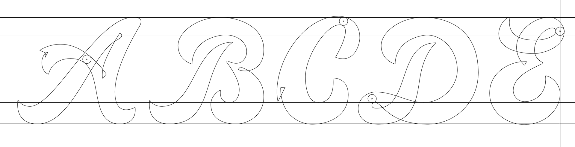
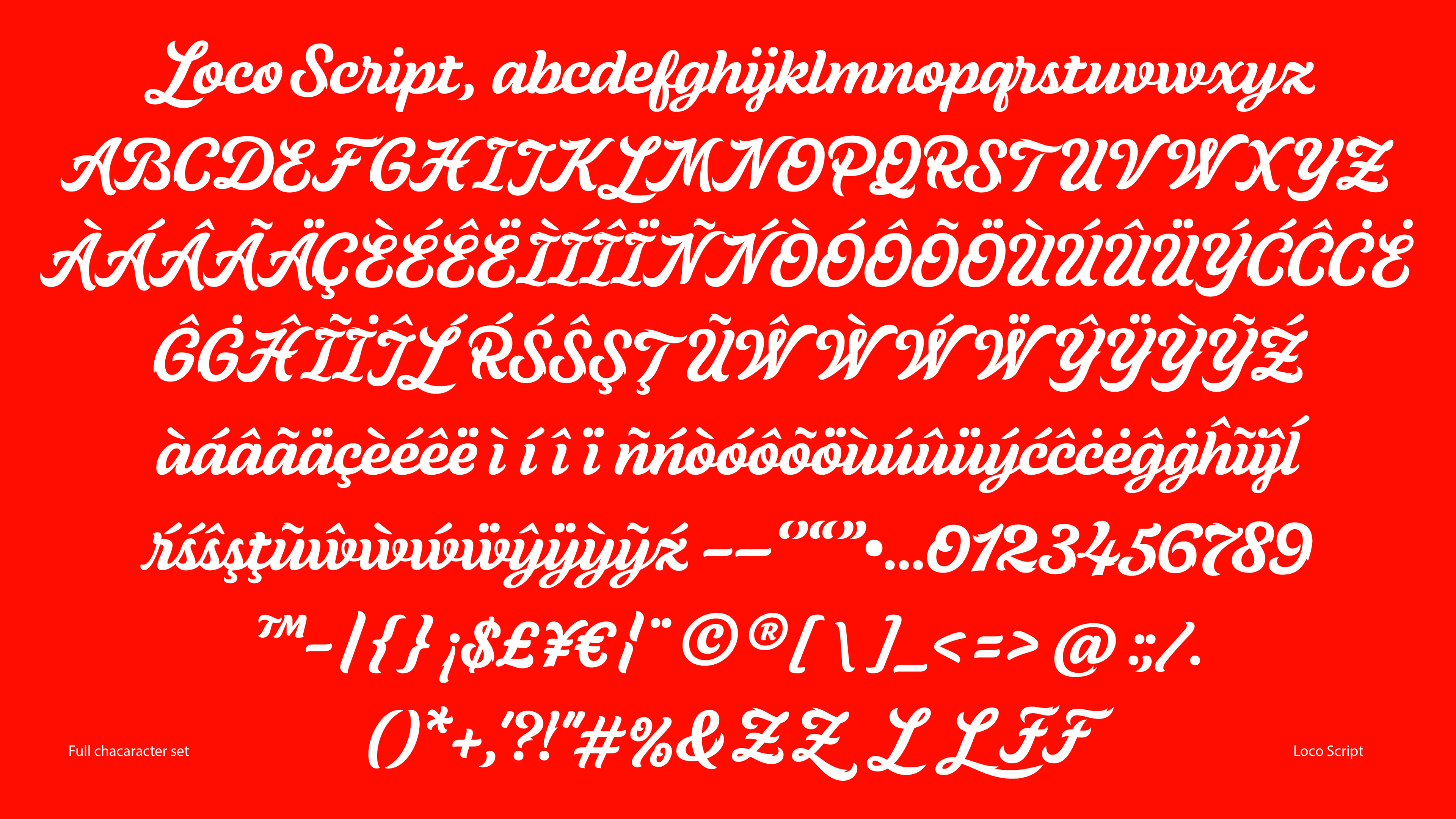
To seal the deal and bring home the win on El Pollo Loco's business, I turned their logo into a full alphabet. During the pitch, I spent a weekend sketching and refining letters for El Pollo Loco's very own font, showing that our vision for the brand extended into every corner of how they show up and communicate.
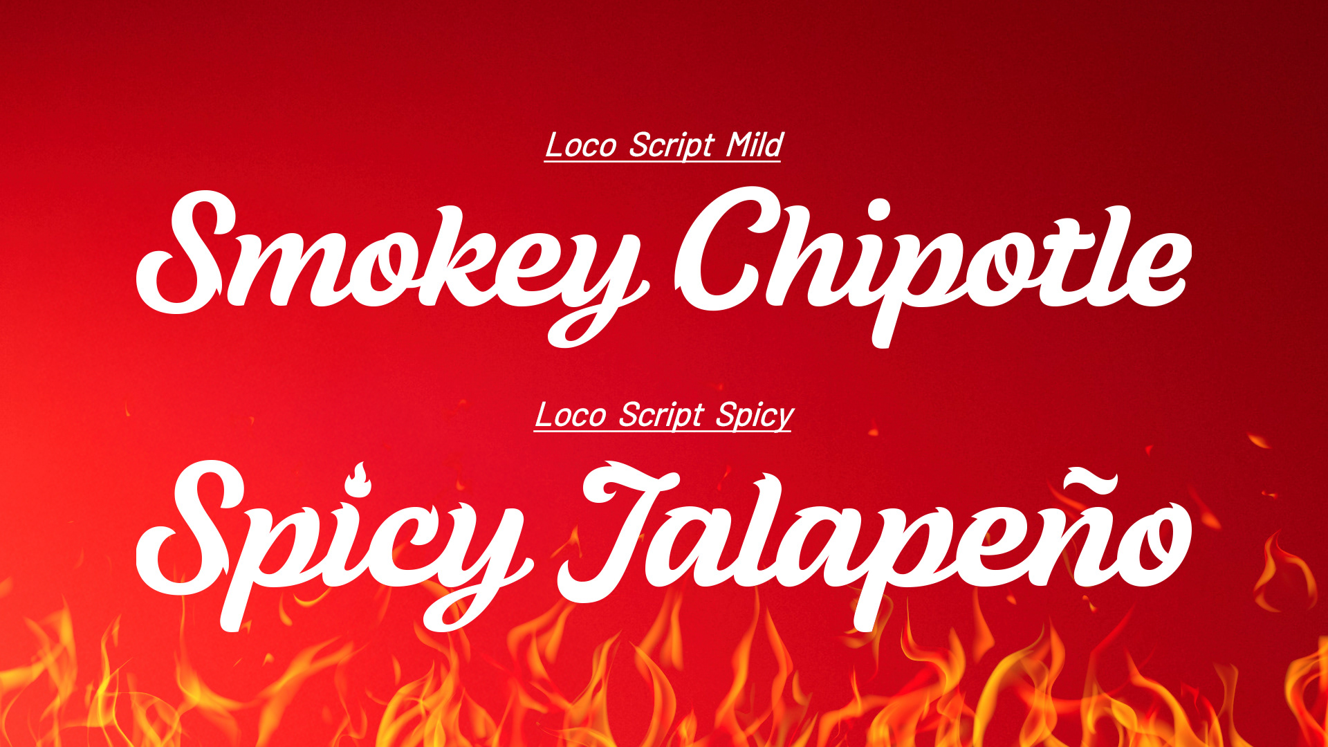
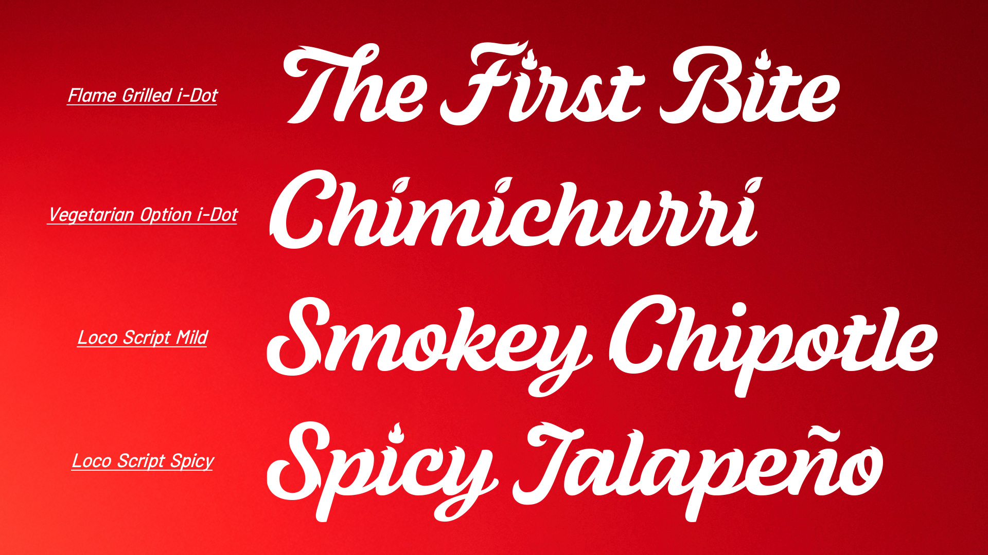
After winning the business, I then spent the next couple months turning those 26 capital letters into a full and functioning typeface with two flavors; Mild & Spicy.
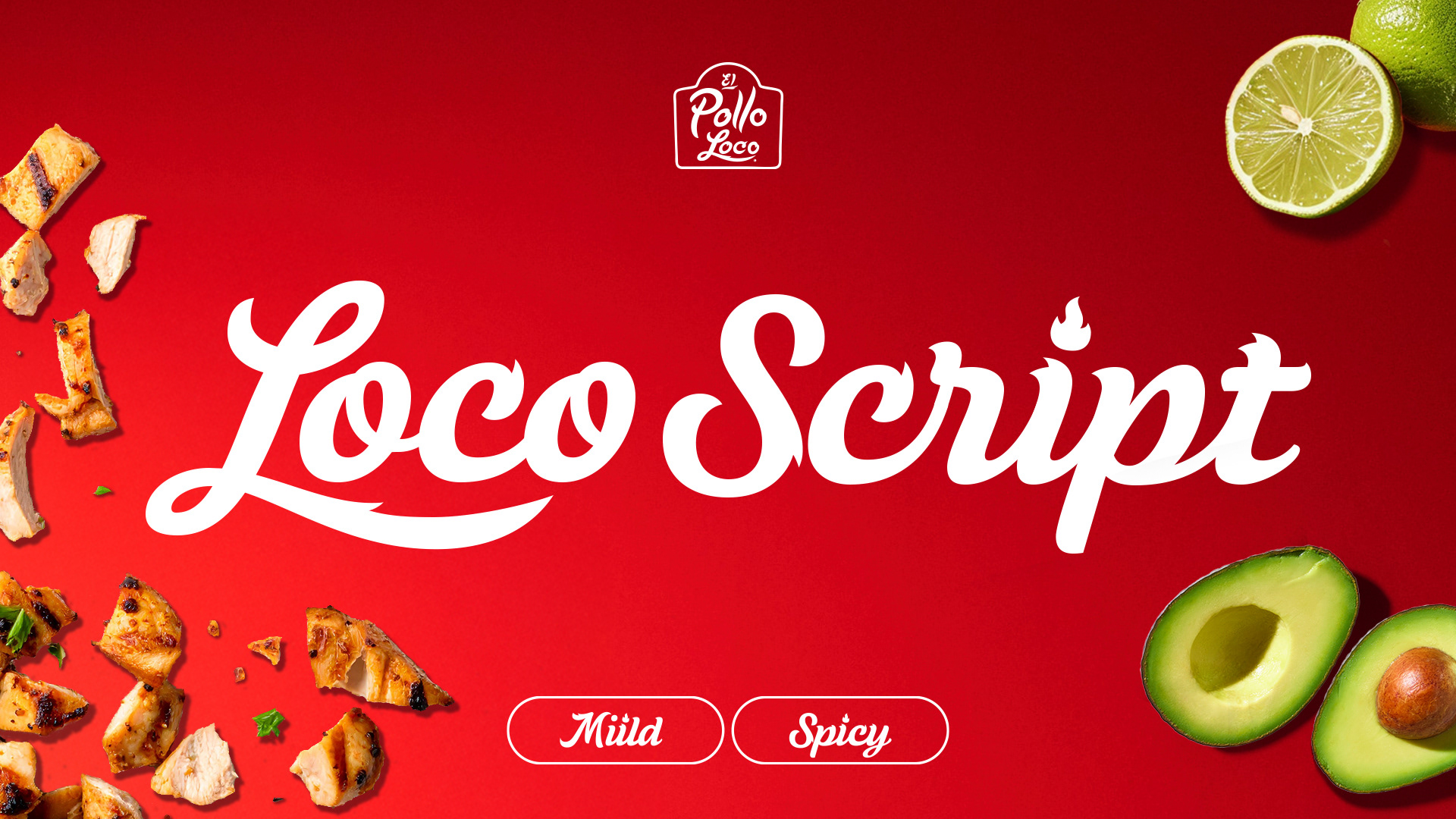
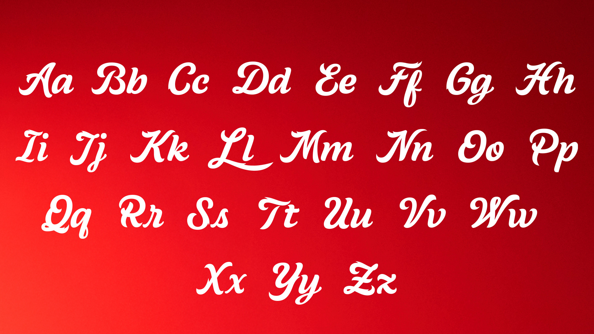
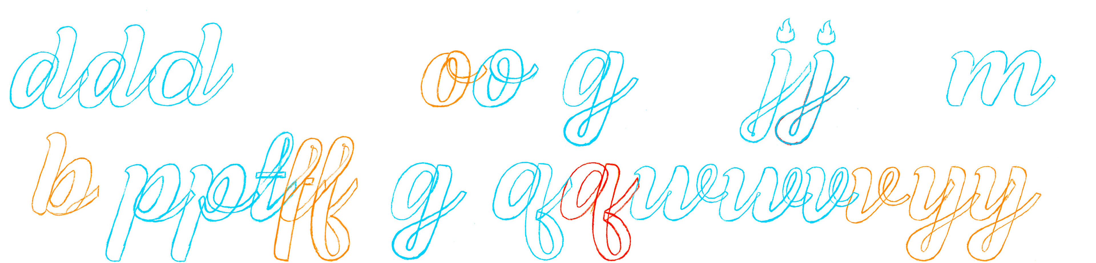
The design process began as dozens of rough ipad sketches, exploring type personality and unique interactions between script letters.

We then handed off my letters to a type foundry, who then helped us refine and expand the typeface into over 500+ glyphs.
CD: Joe Reynoso
ACD: Yomar Augusto
AD/Design: Ryan Owens
ACD: Yomar Augusto
AD/Design: Ryan Owens